
To change the color of a SwiftUI Picker based on its state, use the `.accentColor` modifier. This allows dynamic color adjustments.
SwiftUI provides a powerful way to create user interfaces for iOS apps. One of its versatile components is the Picker, which enables users to choose from multiple options. Customizing the Picker’s appearance and color enhances the user experience. By using the `.
With an accent color modifier, developers can dynamically change the Picker’s color based on different states. This flexibility ensures that the Picker can match the app’s overall theme or respond to specific user interactions. Customization is key in modern app design, and SwiftUI makes it straightforward to implement these changes efficiently. Understanding how to manipulate the Picker’s color can significantly improve your app’s visual appeal and usability.
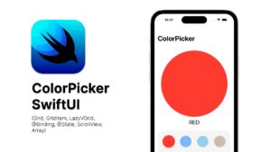
Credit: blog.devgenius.io
Introduction To Swiftui Picker
SwiftUI Picker is a powerful UI component in SwiftUI. It allows users to select from multiple options. This component is easy to use and highly customizable.
What Is Swiftui Picker?
The SwiftUI Picker is a control that displays a list of options. Users can choose one option from the list. It is similar to a dropdown menu in other UI frameworks.
struct ContentView: View {
    @State private var selectedColor = "Red"

    var body: some View {
        Picker("Select a color", selection: $selectedColor) {
            Text("Red").tag("Red")
            Text("Green").tag("Green")
            Text("Blue").tag("Blue")
        }
        .pickerStyle(WheelPickerStyle())
    }
}
Importance In Ui Design
The SwiftUI Picker plays a crucial role in UI design. It simplifies user interactions by presenting choices in an easy-to-navigate format. This enhances the user experience.
| Feature | Benefit |
|---|---|
| Customizable | Matches app’s design |
| Easy to implement | Reduces development time |
| Interactive | Improves user engagement |
- Customizable: Adjust the appearance to fit your app’s theme.
- Intuitive: Users find it easy to navigate through options.
- Efficient: Presents multiple choices without cluttering the screen.
Setting Up Swiftui Picker
SwiftUI Picker is a powerful UI component for selecting items. It allows users to choose from a list of options. Setting up a SwiftUI Picker is simple and intuitive. Let’s explore the basic configuration and integration with views.
Basic Configuration
To start, you need to set up a SwiftUI Picker. Define a state variable to hold the selected value. Use the Picker view to create a picker component.
Here is an example:
            struct ContentView: View {
                @State private var selectedValue = 0
                var options = ["Red", "Green", "Blue"]

                var body: some View {
                    Picker(selection: $selectedValue, label: Text("Select a color")) {
                        ForEach(0..
In this example, @State keeps track of the selected value. The Picker uses a binding to the state variable.
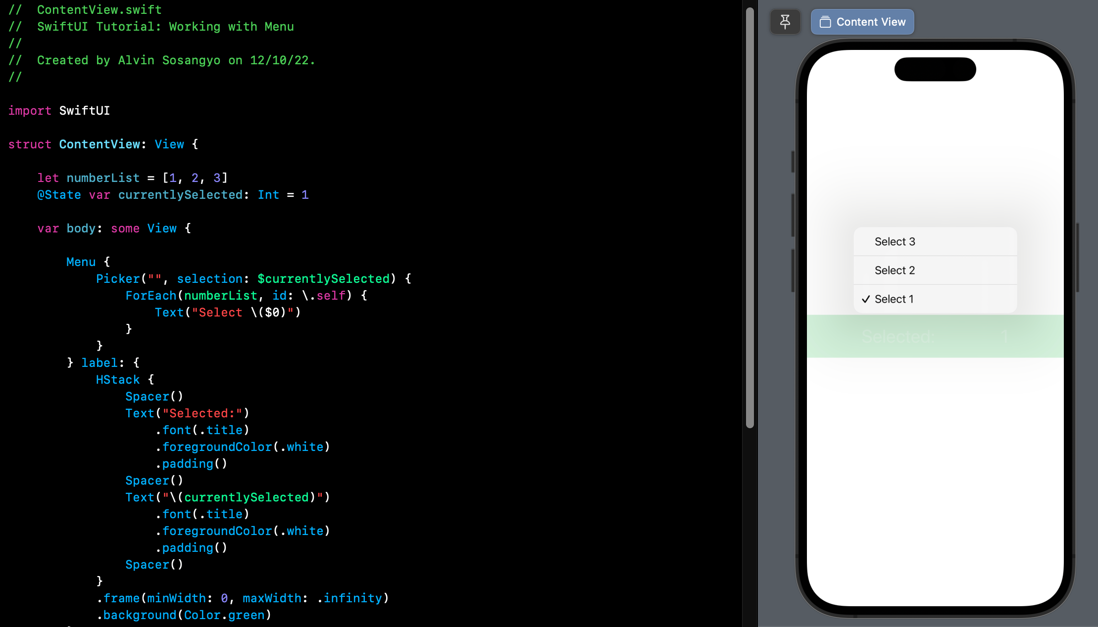
Integrating With Views
Integrating a SwiftUI Picker with other views is straightforward. You can embed it within stacks or other containers. To demonstrate, let’s display the selected color as text.
Here is how you can achieve this:
            struct ContentView: View {
                @State private var selectedValue = 0
                var options = ["Red", "Green", "Blue"]

                var body: some View {
                    VStack {
                        Picker(selection: $selectedValue, label: Text("Select a color")) {
                            ForEach(0..
This code uses a VStack to combine the picker and a text view. The text view displays the selected color. The .foregroundColor modifier changes the text color based on the selection.
Customizing Picker Appearance
SwiftUI offers powerful tools to customize the appearance of pickers. You can change the font, text size, and alignment. This makes your app look unique and user-friendly.
Font And Text Size
To change the font and text size of a picker, use the .font() modifier. You can choose from a variety of fonts and sizes to match your app’s design.
Picker("Select an option", selection: $selectedOption) {
    Text("Option 1").tag(1)
    Text("Option 2").tag(2)
}.font(.headline)
In the example above, the picker uses the headline font style. You can replace .headline with other styles like .largeTitle or .body. This gives you flexibility in your design.
Aligning Elements
Aligning elements in a picker ensures a clean and organized look. Use the .frame() modifier to set the width and height of the picker. This helps in aligning it properly with other UI elements.
Picker("Select an option", selection: $selectedOption) {
    Text("Option 1").tag(1)
    Text("Option 2").tag(2)
}.frame(width: 200, height: 50)
You can use the .alignmentGuide() modifier for precise control. This ensures all elements are perfectly aligned.
Picker("Select an option", selection: $selectedOption) {
    Text("Option 1").tag(1)
    Text("Option 2").tag(2)
}.alignmentGuide(.leading) { d in d[.leading] }
Using these techniques, you can customize the appearance of pickers in SwiftUI. This makes your app more attractive and easy to use.
Changing Picker State Color
SwiftUI makes it easy to customize your app. Changing the Picker state color can give your app a unique look. This guide will show you how to modify the Picker state color.
Default Color Options
SwiftUI offers several default color options. These include:
- Primary: The default color for most elements.
- Secondary: A color used for less important elements.
- Accent: A color that stands out for highlights.
To use these colors in your Picker, apply the appropriate modifier. Below is an example:
Picker("Options", selection: $selectedOption) {
    Text("Option 1").tag(1)
    Text("Option 2").tag(2)
}
.accentColor(.primary) // This sets the Picker to the primary color
Using Custom Colors
Custom colors make your app unique. To use custom colors, create a ColorSet in your Assets folder. Then use the custom color in your Picker. Follow these steps:
- Open your project’s Assets folder.
- Create a new ColorSet.
- Assign a name and set your desired color values.
Next, use the custom color in your Picker:
Picker("Options", selection: $selectedOption) {
    Text("Option 1").tag(1)
    Text("Option 2").tag(2)
}
.accentColor(Color("MyCustomColor")) // Replace "MyCustomColor" with your ColorSet name
These steps help you personalize the Picker state color. Your app will look more professional.
Dynamic Color Changes
Dynamic color changes can make your app more engaging. It helps users visually understand their actions. SwiftUI Picker is powerful for creating interactive interfaces.
Using State Variables
State variables are essential for dynamic color changes. They store the current state of your color. Here’s a simple example:
struct ContentView: View {
    @State private var selectedColor: Color = .red

    var body: some View {
        VStack {
            Picker("Colors", selection: $selectedColor) {
                Text("Red").tag(Color.red)
                Text("Blue").tag(Color.blue)
                Text("Green").tag(Color.green)
            }
            .pickerStyle(SegmentedPickerStyle())

            Rectangle()
                .fill(selectedColor)
                .frame(width: 100, height: 100)
        }
    }
}
In this example, the rectangle’s color changes based on the Picker selection. The State variable @State private var selectedColor controls the color.
Color Transitions
Color transitions can make changes smoother. Using the .animation modifier, you can animate color changes:
struct ContentView: View {
    @State private var selectedColor: Color = .red

    var body: some View {
        VStack {
            Picker("Colors", selection: $selectedColor) {
                Text("Red").tag(Color.red)
                Text("Blue").tag(Color.blue)
                Text("Green").tag(Color.green)
            }
            .pickerStyle(SegmentedPickerStyle())

            Rectangle()
                .fill(selectedColor)
                .frame(width: 100, height: 100)
                .animation(.easeInOut)
        }
    }
}
In this example, the rectangle’s color transition becomes smoother. The animation modifier .animation(.easeInOut) makes the color change gradual.
Dynamic color changes can make your app more interactive. Using state variables and animations, you can create a seamless user experience.
Conditional Color Changes
SwiftUI offers various ways to make your app engaging. One cool feature is the SwiftUI Picker State Color. You can change the color based on conditions. This adds a dynamic feel to your app. Let’s explore two methods to achieve this.
Based On User Input
Changing colors based on user input makes your app interactive. For instance, you can alter the picker color depending on the selected option. Below is a simple example:
| User Input | Picker Color |
|---|---|
| Option 1 | Red |
| Option 2 | Green |
| Option 3 | Blue |
Here’s how you can implement this in SwiftUI:
struct ContentView: View {
    @State private var selectedOption = 0
    var body: some View {
        Picker("Options", selection: $selectedOption) {
            Text("Option 1").tag(0)
            Text("Option 2").tag(1)
            Text("Option 3").tag(2)
        }
        .pickerStyle(SegmentedPickerStyle())
        .background(selectedOption == 0 ? Color.red : selectedOption == 1 ? Color.green : Color.blue)
    }
}
The background modifier changes color based on the selected tag.
Based On App State
Sometimes, the color change depends on the app state. For example, you might want to change the picker color when the app is in dark mode.
struct ContentView: View {
    @Environment(\.colorScheme) var colorScheme
    var body: some View {
        Picker("Options", selection: .constant(1)) {
            Text("Option 1").tag(0)
            Text("Option 2").tag(1)
            Text("Option 3").tag(2)
        }
        .pickerStyle(SegmentedPickerStyle())
        .background(colorScheme == .dark ? Color.black : Color.white)
    }
}
In this example, the colorScheme environment variable is used. The picker background changes based on the app’s color scheme.
These conditional color changes make your SwiftUI app more responsive. Try these methods to enhance your app’s user experience.
Animating Picker Color
Animating Picker Color in SwiftUI can make your app more engaging. SwiftUI offers several ways to animate colors in your Picker. These animations can be simple or complex.
Basic Animations
Basic animations in SwiftUI are simple to implement. You can use the .animation() modifier. This makes your Picker color change smoothly.
Here’s an example code snippet:
Picker("Select Color", selection: $selectedColor) {
    Text("Red").tag(Color.red)
    Text("Green").tag(Color.green)
    Text("Blue").tag(Color.blue)
}
.pickerStyle(SegmentedPickerStyle())
.background(selectedColor)
.animation(.easeInOut)
This code adds a basic animation to the Picker. The background color changes with ease.
Advanced Animation Techniques
Advanced animations can make your Picker more dynamic. You can combine multiple animations. This creates a more engaging experience.
Here is a more complex example:
@State private var selectedColor: Color = .red
@State private var scale: CGFloat = 1.0

Picker("Select Color", selection: $selectedColor) {
    Text("Red").tag(Color.red)
    Text("Green").tag(Color.green)
    Text("Blue").tag(Color.blue)
}
.pickerStyle(SegmentedPickerStyle())
.background(selectedColor)
.scaleEffect(scale)
.animation(Animation.easeInOut(duration: 1.0).repeatForever(autoreverses: true))
.onChange(of: selectedColor) { newColor in
    self.scale = 1.5
    DispatchQueue.main.asyncAfter(deadline: .now() + 0.5) {
        self.scale = 1.0
    }
}
This code example uses both color and scale animations. It adds a bounce effect to the Picker.
By combining animations, you can create rich, interactive experiences. This will delight your users.
Accessibility Considerations
Ensuring accessibility in SwiftUI Picker State Color is crucial. It enhances user experience for everyone, including those with disabilities. This section covers key accessibility considerations for your app.
Color Contrast
High color contrast is essential. It helps users with visual impairments. The text must stand out against the background. Use tools to check contrast ratios. Aim for a ratio of at least 4.5:1.
| Foreground Color | Background Color | Contrast Ratio |
|---|---|---|
| Black | White | 21:1 |
| Dark Gray | Light Gray | 7:1 |
Supporting Color Blindness
Color blindness affects many users. Design pickers with this in mind. Avoid relying on color alone to convey information.
- Use icons and labels alongside colors.
- Provide textual descriptions for color choices.
- Test your app with color blindness simulators.
Consider using patterns or textures. These can help differentiate options. This ensures everyone can use your app effectively.
Performance Optimization
Optimizing performance is crucial for a smooth SwiftUI experience. Ensuring efficient color rendering and reduced memory usage can significantly enhance your app’s performance.
Efficient Color Rendering
Rendering colors efficiently can boost app performance. Use SwiftUI’s Color views wisely. Avoid unnecessary state updates to keep rendering smooth.
For instance, use a single Color view instead of multiple views. This minimizes rendering overhead.
- Use
Colorviews sparingly. - Avoid frequent state updates.
Consider using pre-defined colors instead of dynamic ones. This reduces computation time.
Reducing Memory Usage
Memory optimization is key for SwiftUI performance. Use lightweight color objects to save memory.
Follow these tips to reduce memory usage:
- Prefer
ColoroverUIColor. - Avoid creating multiple instances of the same color.
Reuse color objects whenever possible. This practice conserves memory and enhances efficiency.
Integrating With Other Ui Elements
SwiftUI’s Picker is versatile. It integrates smoothly with other UI elements. This section shows how to combine it with buttons and sliders. Understanding these integrations enhances your app’s functionality.
Combining With Buttons
Combining the Picker with buttons can create interactive experiences. For example, you can reset the Picker’s selection using a button click. Below is an example:
struct ContentView: View {
    @State private var selectedColor = "Red"
    let colors = ["Red", "Green", "Blue"]

    var body: some View {
        VStack {
            Picker("Select a color", selection: $selectedColor) {
                ForEach(colors, id: \.self) {
                    Text($0)
                }
            }
            .pickerStyle(SegmentedPickerStyle())

            Button(action: {
                selectedColor = "Red"
            }) {
                Text("Reset")
            }
        }
    }
}
This code creates a Picker with three color options. The button resets the Picker to “Red”.
Syncing With Sliders
Syncing a Picker with sliders can adjust UI elements dynamically. For example, you can change the background color based on the Picker’s value. Here’s how:
struct ContentView: View {
    @State private var selectedColor = "Red"
    let colors = ["Red", "Green", "Blue"]

    var body: some View {
        VStack {
            Picker("Select a color", selection: $selectedColor) {
                ForEach(colors, id: \.self) {
                    Text($0)
                }
            }
            .pickerStyle(SegmentedPickerStyle())

            Slider(value: .constant(0.5))
                .padding()
                .background(getBackgroundColor(for: selectedColor))
        }
    }

    func getBackgroundColor(for color: String) -> Color {
        switch color {
        case "Red":
            return Color.red
        case "Green":
            return Color.green
        case "Blue":
            return Color.blue
        default:
            return Color.white
        }
    }
}
This code snippet syncs the Picker with a slider. It adjusts the background color based on the selected option.
User Interaction Feedback
SwiftUI Picker provides a smooth, interactive experience. User feedback is crucial for enhancing this experience. Interaction feedback helps users feel more in control and confident in their choices.
Highlighting Selections
Highlighting selections makes it easier for users to see their choices. SwiftUI Picker allows you to change the color of the selected item. This can be done using the .foregroundColor() modifier.
Here’s a simple example:
Picker("Select a color", selection: $selectedColor) {
    Text("Red").tag(Color.red)
    Text("Green").tag(Color.green)
    Text("Blue").tag(Color.blue)
}
.foregroundColor(selectedColor)
In this example, the selected color will change the text color of the Picker. This visual feedback assures users that their selection has been registered.
Providing Haptic Feedback
Haptic feedback adds a tactile layer to the user experience. SwiftUI offers built-in support for haptic feedback. This can be integrated into the Picker selections.
Here’s how you can add haptic feedback:
import SwiftUI
import CoreHaptics

struct ContentView: View {
    @State private var selectedColor: Color = .red
    private let hapticEngine = try? CHHapticEngine()

    var body: some View {
        Picker("Select a color", selection: $selectedColor) {
            Text("Red").tag(Color.red)
            Text("Green").tag(Color.green)
            Text("Blue").tag(Color.blue)
        }
        .onChange(of: selectedColor) { _ in
            let feedbackGenerator = UIImpactFeedbackGenerator(style: .medium)
            feedbackGenerator.impactOccurred()
        }
    }
}
In this code, a haptic feedback occurs every time the selection changes. This tactile feedback provides an additional layer of interaction, making the experience more engaging.
Using Predefined Color Palettes
Using predefined color palettes in SwiftUI Picker can enhance your app’s design. Color palettes ensure consistency and visual appeal. Let’s explore how to use these palettes effectively.
Apple’s Color Palettes
Apple provides several predefined color palettes. These colors maintain a consistent look across different iOS apps. Here are some commonly used color palettes:
- System Colors: These are dynamic and adapt to Light or Dark mode.
- Label Colors: These include primary, secondary, and tertiary labels.
- Background Colors: These include system background, secondary background, and tertiary background.
Using these predefined colors in SwiftUI Picker is simple. Use the following code:
Picker("Select a Color", selection: $selectedColor) {
    Text("Red").foregroundColor(.red)
    Text("Green").foregroundColor(.green)
    Text("Blue").foregroundColor(.blue)
}
Creating Custom Palettes
Sometimes you need a unique color palette. SwiftUI allows you to create custom palettes. Follow these steps to create your palette:
- Define your custom colors in your assets catalog.
- Reference these colors in your SwiftUI code.
Here is an example of defining custom colors:
// Define colors in the assets catalog
And here is how to use them in SwiftUI:
Picker("Select a Custom Color", selection: $customColor) {
    Text("Custom Red").foregroundColor(Color("CustomRed"))
    Text("Custom Green").foregroundColor(Color("CustomGreen"))
    Text("Custom Blue").foregroundColor(Color("CustomBlue"))
}
Utilizing both predefined and custom color palettes enhances your app’s UI. SwiftUI Picker makes it easy to implement these colors.
Debugging Color Issues
SwiftUI’s Picker is a powerful tool for creating selection interfaces. However, developers often face color issues. These issues can make your app look unprofessional. Fortunately, debugging them is straightforward.
Common Problems
Several common problems lead to color issues in SwiftUI Pickers:
- Incorrect Color Binding: The color might not bind correctly.
- Default Styling: SwiftUI applies default styles that override custom colors.
- Unsupported Color Spaces: Some colors may not display correctly in all color spaces.
Effective Solutions
Let’s explore some effective solutions to these common problems:
- Check Color Binding: Ensure your color binding is correct. Use the following code for a proper binding:
@State private var selectedColor: Color = .red Picker("Select a Color", selection: $selectedColor) { Text("Red").tag(Color.red) Text("Green").tag(Color.green) Text("Blue").tag(Color.blue) } .pickerStyle(SegmentedPickerStyle())- Override Default Styling: Use custom modifiers to override default styles:
Picker("Select a Color", selection: $selectedColor) { Text("Red").tag(Color.red).foregroundColor(.red) Text("Green").tag(Color.green).foregroundColor(.green) Text("Blue").tag(Color.blue).foregroundColor(.blue) } .pickerStyle(SegmentedPickerStyle())- Use Supported Color Spaces: Stick to colors compatible across different devices:
Color(.sRGB, red: 1.0, green: 0.0, blue: 0.0, opacity: 1.0)
By addressing these issues, your SwiftUI Picker will display colors correctly. Remember, correct binding, overriding default styles, and using supported color spaces are key.

Credit: swiftquickstart.blogspot.com
Working With Dark Mode
SwiftUI makes it easy to support Dark Mode in your apps. It’s crucial to ensure your UI elements are visible and aesthetically pleasing. One such element is the Picker. Adjusting its state color for Dark Mode involves several considerations.
Color Adjustments
Dark Mode changes the appearance of your app. SwiftUI allows dynamic color adjustments. Use the Color struct to define colors.
Here’s an example:
let backgroundColor = Color("background")
let textColor = Color("text")
Define these colors in your Assets.xcassets folder. Specify different colors for Light and Dark Modes.
Using predefined system colors can also help:
let primaryColor = Color.primary
let secondaryColor = Color.secondary
Ensuring Visibility
Visibility is essential, especially in Dark Mode. Ensure your Pickers are readable.
To achieve this, use contrasting colors. For instance, a light text color on a dark background.
Here’s a code snippet:
Picker("Options", selection: $selection) {
    Text("Option 1").foregroundColor(Color.white)
    Text("Option 2").foregroundColor(Color.white)
}.background(Color.black)
This code ensures the text is visible in Dark Mode.
Another tip is to use semantic colors. These adapt automatically to the current mode:
Text("Hello, World!")
    .foregroundColor(Color.primary)
    .background(Color(UIColor.systemBackground))
By following these practices, your SwiftUI Picker will look great in both Light and Dark Modes.
Testing Picker Color Changes
Testing color changes in SwiftUI pickers can be challenging. Ensuring your app reacts correctly to picker changes is crucial. This section explores unit tests and UI tests for SwiftUI pickers.
Unit Tests
Unit tests verify that individual parts of your code work as expected. For SwiftUI pickers, unit tests help ensure the correct color is set.
Here’s a simple example:
    import XCTest
    @testable import YourApp

    class PickerColorTests: XCTestCase {
        func testPickerColorChange() {
            let pickerViewModel = PickerViewModel()
            pickerViewModel.selectedColor = .red
            XCTAssertEqual(pickerViewModel.selectedColor, .red)
        }
    }
In this example, the test checks if the selected color changes to red.
Ui Tests
UI tests check the user interface’s behavior. For SwiftUI pickers, UI tests ensure the picker changes the color correctly.
Here’s how to do it:
    import XCTest

    class PickerColorUITests: XCTestCase {
        func testPickerColorChange() {
            let app = XCUIApplication()
            app.launch()
            let picker = app.pickers["colorPicker"]
            picker.adjust(toPickerWheelValue: "Red")
            let selectedColor = app.staticTexts["selectedColorLabel"].label
            XCTAssertEqual(selectedColor, "Red")
        }
    }
This UI test verifies the picker changes the color to red and updates the label.
Real-world Examples
SwiftUI Pickers are versatile. They are used in various apps. Their color states play a crucial role. Let’s dive into real-world examples.
E-commerce Apps
In e-commerce apps, SwiftUI Pickers enhance user experience. They make product selection easy. For instance, imagine a clothing store app. Users can select sizes, colors, and quantities using Pickers.
The Picker’s state color indicates availability. Green shows items in stock. Red indicates out-of-stock items. This visual cue helps users quickly. They can decide without extra clicks.
| Picker State | Color |
|---|---|
| In Stock | Green |
| Out of Stock | Red |
Health And Fitness Apps
Health and fitness apps use SwiftUI Pickers to set goals. Users can pick exercise types, durations, and intensities. Each Picker state color represents a different level.
For example, a user sets a running goal. They pick the intensity level. Green indicates a beginner level. Yellow shows intermediate. Red is for advanced users.
- Beginner: Green
- Intermediate: Yellow
- Advanced: Red
This color coding helps users understand their choices. It makes goal-setting intuitive and engaging.
Best Practices
Implementing the SwiftUI Picker State Color effectively enhances your app’s user experience. Following best practices ensures your design is both user-friendly and visually appealing. Let’s explore some key strategies for using picker state color in SwiftUI.
Consistent Color Usage
Use consistent colors for picker states. This helps users recognize actions easily. Choose a limited color palette that aligns with your brand. Consistency fosters familiarity and trust.
- Primary Color: Use for active states.
- Secondary Color: Use for inactive or disabled states.
- Accent Color: Use to highlight important actions.
Avoid using too many different colors. It can confuse users. Stick to a simple color scheme.
User-friendly Design
Design your picker to be intuitive and accessible. Ensure text and background colors have enough contrast. This makes it easier to read.
| State | Color | Description |
|---|---|---|
| Active | Primary Color |
Indicates the current selection. |
| Inactive | Secondary Color |
Indicates an unselected option. |
| Highlight | Accent Color |
Draws attention to important choices. |
Test your design with real users. This helps identify and fix issues early. Make sure the design works well for everyone.
Resources And Tools
When working on SwiftUI Picker State Color, having the right resources and tools is essential. This section highlights helpful libraries and online tutorials to enhance your SwiftUI skills.
Helpful Libraries
Using libraries can save you time and effort. Here are some of the most helpful libraries for SwiftUI Picker State Color:
- SwiftUIX: A comprehensive library extending SwiftUI capabilities.
- Introspect: Allows accessing underlying UIKit components.
- Combine: Simplifies handling asynchronous events in SwiftUI.
Online Tutorials
Online tutorials can be a goldmine of information. Here are some of the best places to find SwiftUI Picker State Color tutorials:
- Ray Wenderlich: Offers detailed, step-by-step SwiftUI tutorials.
- Hacking with Swift: Provides practical SwiftUI guides and examples.
- Paul Hudson’s YouTube Channel: Features easy-to-follow SwiftUI video tutorials.
With these libraries and tutorials, you can master SwiftUI Picker State Color efficiently.
Future Trends
SwiftUI is evolving quickly. Developers see many exciting changes and improvements. One area of interest is the Picker State Color. Let’s explore the future trends in this domain.
Upcoming Features
SwiftUI is likely to introduce new features soon. These features will enhance the Picker State Color functionality.
- Custom Color Palettes: Developers may soon create their own color palettes.
- Dynamic Color Changes: Pickers might support real-time color changes based on user actions.
- Improved Accessibility: Colors could adapt to accessibility settings, improving user experience.
Emerging Design Trends
Design trends are always changing. The Picker State Color in SwiftUI is no exception.
- Minimalistic Design: Simple and clean color schemes are trending. They make the interface look elegant and easy to use.
- Dark Mode Support: More apps now support dark mode. Pickers should adapt their colors to match dark mode settings.
- Gradient Colors: Gradients are becoming popular. They add depth and interest to the user interface.
Understanding these trends helps developers stay ahead. SwiftUI Picker State Color will continue to evolve, offering more customization and better user experiences.
Frequently Asked Questions
How To Change Picker Color In Swiftui?
To change the Picker color in SwiftUI, use the `. accentColor` modifier. This allows you to set a custom color for the selected item. For example, use `. accentColor(. red)` to set the Picker color to red.
Can Picker State Affect Its Color?
Yes, the Picker state can affect its color. The `. accentColor` modifier can be dynamically updated based on the state. This enables you to change the Picker color when the state changes.
Which Swiftui Modifier Changes Picker Color?
The `. accentColor` modifier changes the Picker color. Apply it directly to the Picker to customize its appearance. This modifier supports various colors to match your app’s theme.
Is It Possible To Customize Picker Appearance?
Yes, it is possible to customize Picker appearance in SwiftUI. Use modifiers like `. accentColor`, `. font`, and `. foregroundColor` for customization. These allow you to create a unique and visually appealing Picker.
Conclusion
Mastering SwiftUI Picker state color enhances your app’s user experience. It brings a polished look and feel. Experiment with different colors and states. Your app will stand out and delight users. Start customizing today and see the difference. SwiftUI Picker customization is a powerful tool in your development arsenal.